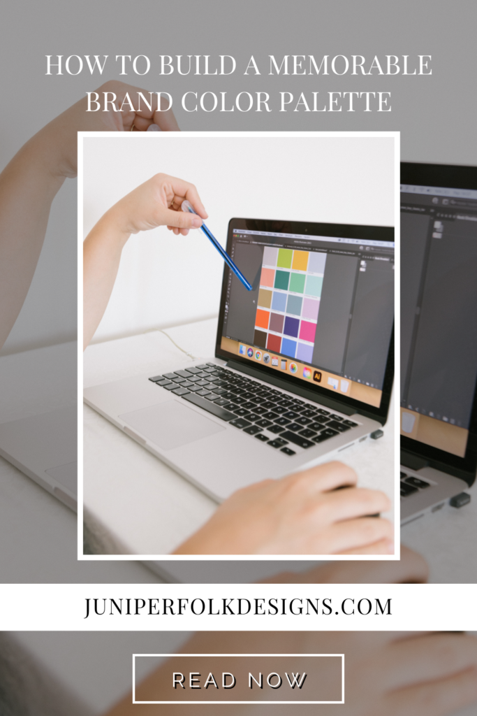
Color. It’s literally all around us, and we perceive different colors differently.
But here’s the real question, how do we implement that into brand design?
If you’re a business owner, chances are you’ve heard the term color palette, and you know this is something you need. But why?
Because colors are part of the unspoken language of design that community emotions to our audience.
That’s why it’s crucial to have a memorable color palette that seamlessly conveys the brand message to your target audience.
Here are my six tips for building a memorable color palette.
Colors are used to evoke emotions.
Colors are used to evoke emotions, cultural norms, and familiar objects. For example, red is often associated with anger, blue with peace and tranquility, and green with nature and growth.
Colors also have universal meaning. For example, red means stop in many countries. Black is associated with death or mourning in many cultures. White means purity in many cultures.
More prominent companies use this in their branding, and we don’t necessarily notice it.
Fast food restaurants globally use colors like red, yellow, and blue around their stores because it revs up people’s appetites, making them hungry. Likewise, Twitter and Facebook use blue because blue can be used to promote communication and interaction.
Fun fact: the dark green used in Juniperfolk Designs is a dark, slightly yellow-hued green that stands for happiness (yellow) and green (trust & rebirth).
Some colors are considered safer than others.
If your brand was a person, what personality would it have? What emotion does your brand elicit? Once you’ve determined that, you can start looking for colors that will reflect the type of emotion you’re trying to convey.
For example, red can be a very attractive color for brands to work with, but a BIG color to use. It stands for passion, lust, and confidence. But also; anger, blood, and danger.
Your palette can evolve over time.
Your palette can evolve over time. I say that twice because some business owners fear that it can never change once they settle on a color palette. This simply isn’t true.
Your brand & business will change and grow over time because you, as a human, will do precisely that. And that’s a good thing!
You have a lot of creative freedom to structure your brand colors and use them throughout your website. The key is to not change it too often or too drastically; otherwise, people won’t be able to identify with you and your brand anymore.
Suppose you want to update your color palette. In that case, you can always set up a VIP day with me & we can work together to create a brand identity that conveys the emotions you want.
There’s a fine line between too many colors and not enough colors.
It’s tempting to use a wide range of colors in your brand color palette. After all, it’s essential to be unique and stand out from the competition! But there is such a thing as too many colors; too-long lists can feel overwhelming and chaotic. You want your company’s identity to feel modern and fresh, but don’t go overboard. Using multiple bright colors could feel distracting or even give your audience a headache.
On the other hand, if you choose too few colors, your brand may appear dull or boring. People are naturally drawn to vibrant colors—one study showed that 85% of shoppers cite color as their primary reason for purchasing a product they both liked and needed! Variety is also vital; using just one color can make you seem inflexible and lacking in creativity.
A good rule of thumb is three-to-five colors: this is enough to incorporate some variety without complicated things. A nicely balanced palette will also help you weave visual continuity throughout your brand while keeping things fresh!
Organize your palette into primaries and accents.
While using a rainbow of colors is one option, it may not always be the best choice. Organizing your palette into primaries and accents will keep everything balanced while giving you options for highlighting specific areas or creating contrast.
Your brand’s primary color should be the most nuanced; this is what makes up 60% of your palette and should cover larger areas like backgrounds, headers/footers/menus, etc. The secondary color (30%) pops in smaller amounts like buttons and CTAs. Finally, add contrast with an accent color sparingly used (10%) to highlight text links or call out specific actions or features on your site.
Make sure your palette is versatile and accessible across all mediums.
Regardless of how you decide to create your palette, you’ll want to make sure that your colors are versatile and accessible across all mediums.
To do this, check how the colors look on various platforms. I recommend doing this by creating a Google slide presentation with each color on its own page. Check how these colors look using different devices and operating systems (Windows, Mac OS X, Android, etc.) to make sure they’re legible and appropriate for every viewer’s context.
You should make sure that the colors work well with each other. This is a simple step but often forgotten. Your colors should work well when paired with each other–meaning they have enough contrast to stand out & enough likeness to complement each other.
I hope this helps as you begin to build your color palette for your brand & if you have any questions, send me a DM or email. I would love to help out.
If you need a brand identity–you can contact me here!
Xoxo Claire


May 20, 2022
How to Build a Memorable Brand Color Palette
