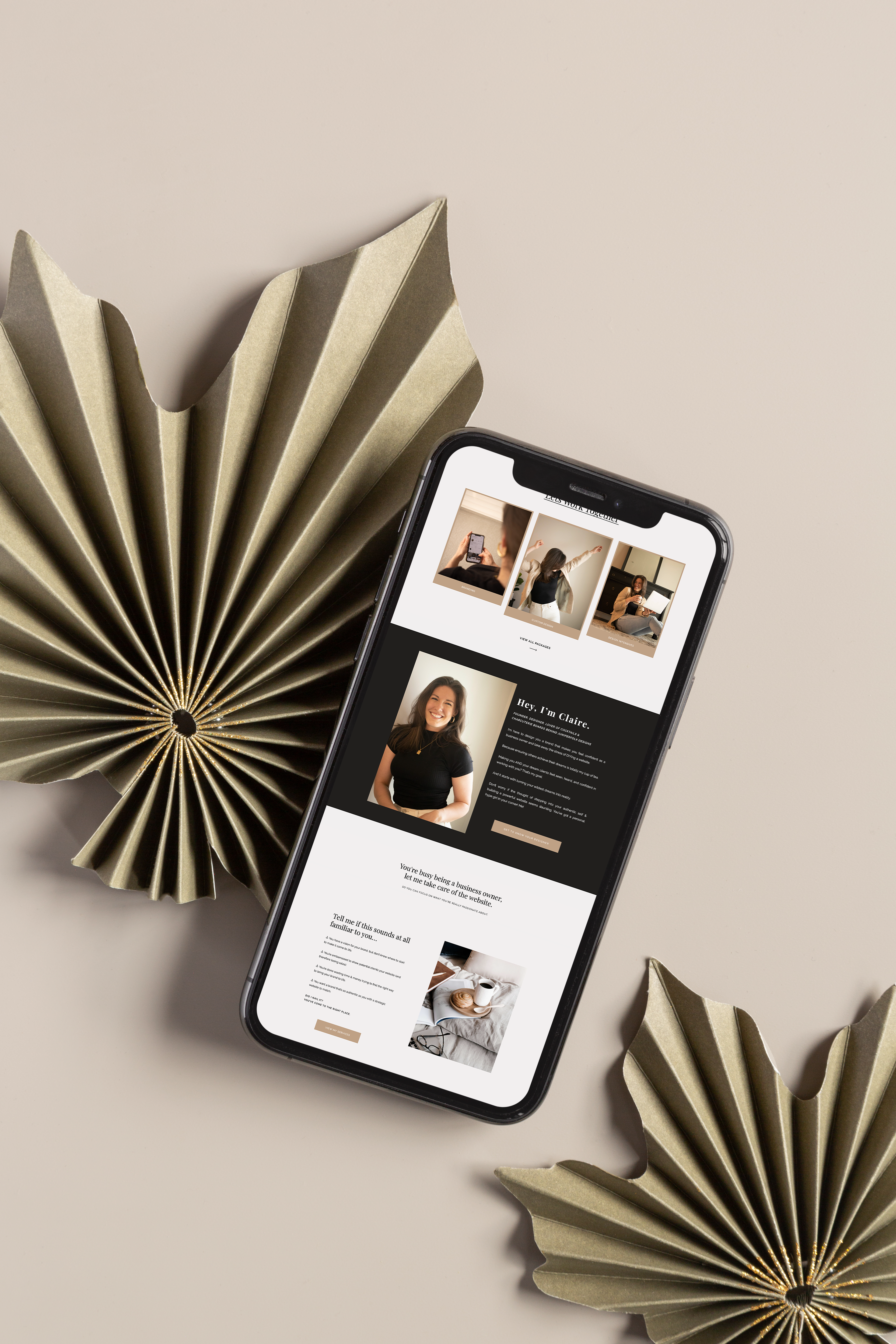
Use these 6 simple tricks to increase your website traffic and turn your website homepage into a homepage that converts and turns your visitors into clients.
1. Clear & Direct Header Statement
It’s no secret you have to grab your website visitor’s attention quicker than ever before, but did you know that you only have 7 seconds to convince them to stay on your site?
That’s why your header on your website is so important. (No pressure, right?)
The statement within this header can make or break your website & either be the thing that leads to a higher conversion rate or could be to your detriment.
An easy way to ensure that your statement succeeds is to make it as straightforward as possible without overwhelming the visitor.
You need to state who you are, what you do, and who you help.
This is NOT where you introduce yourself. There is no need to take up your precious header space by stating your name. Truthfully, nobody cares about that.
2. Utilize Design Theory (Branding + Brand Photos)
Have you ever heard of branding psychology? This is where it will come into play for your website. How your audience perceives your website is heavily influenced by the branding you choose.
If you choose a bold font with a bright red color palette, your brand will come off much more aggressive than a simple serif font with a color palette of yellow & neutrals.
When you work with a brand designer, they will design your brand with intentions for your branding to attract your target audience & your web designer will strategically implement this into your website.
Another critical part of this tip is ensuring you incorporate brand photos of yourself into the website. Professional brand photos give your brand authority & agency over your competitors.
Just think, who would you trust more? A website with clearly professional and curated branding photography or someone with a few iPhone pictures?
3. Engaging Copy
The third piece of the puzzle- is your website copy. The words on your website matter more than you think. It’s trendy these days to visit a website, read their copy, and not understand or learn anything.
Your website should say precisely what you mean, with the least amount of words possible.
Gone are the overused filler words & fluff that distract from your messaging. Instead, clear, concise, & engaging website copy is critical in web design.
4. Strong CTAs
Sometimes people need to be reminded. If your website visitor has scrolled past your service, offers, and story and is still not convinced, it’s time for a CTA (call to action).
These little guys are responsible for grabbing your viewer’s attention and giving them the last little push it takes to convert them into customers.
Your call to action should use exciting words that command your reader to take a specific action and make them feel as though they are losing out on value if they don’t!
A few examples of this are:
- Elevate your business today
- Give me that discount!
- Uplevel my brand!
- Change my life!
- Don’t miss out!
5. Strategic Navigation
I might get a lot of hate for this, but I genuinely do not love hamburger menus. By that, I mean the menu in the top right or left corner of your website that, when clicked, opens up a more extensive menu & displays the rest of your page links.
Here’s why.
- They limit your demographic reach
- User confusion & frustration
- It makes the user feel like the content isn’t as important because it’s not on display
- They are harder to navigate (multiple clicks instead of just 1)
This isn’t to say that these shouldn’t ever be used. It just means that they should be well-thought-out before it’s decided because we like the look of it.
I should also note that I do agree with using a hamburger menu for mobile design.
6. Social Proof (testimonials, wards, accolades)
People need to trust you for them to work with you. That’s why it’s essential to include social proof on your homepage.
By social proof, I mean including testimonials from past clients, awards you’ve won in your industry, & anything else that positions you and your brand in a place of authority and trust with your target audience.
When your ideal client sees that other people have worked with you and seen success in their business, they are much more likely to decide to work with you as well.
What do you think? Are you ready to build the perfect homepage? Click here to work with me today!
August 1, 2022
6 Must-Haves for a Homepage That Converts
